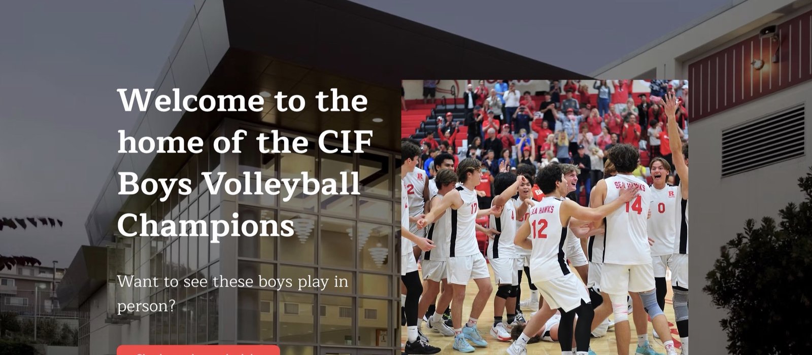
Our mission was to translate the explosive, vertical energy of volleyball into a cohesive digital experience for the RUHS program. We aimed to replace static, outdated templates with a "Kinetic Visual Language."
The design channels a raw vertical motion, the precise excitement of the game's arc. From the typography to the colour palette, each element is deliberately selected to embody the high-performance mentality of the RUHS program. Dynamic movement and editorial precision sit at the core of every composition created — decisive movement.


The Typography System
Type Hierarchy & Specimen
We selected a bold, high-impact typeface to mirror the program's elite mentality. The condensed forms create visual tension while maintaining legibility at scale. This is paired with a refined body face for editorial clarity across digital and print.
01. Challenge
The athletic dept relied on stock templates that failed to capture the energy and culture of the program. The challenge was to create a bold, ownable identity from scratch.
02. Approach
We developed a systematic visual language rooted in vertical movement — a nod to the sport itself. We treated every asset as a high-end editorial composition.
03. Result
40%
Increase in engagement
100
Assets delivered
Let's build something exceptional together. Get in touch to start your project.