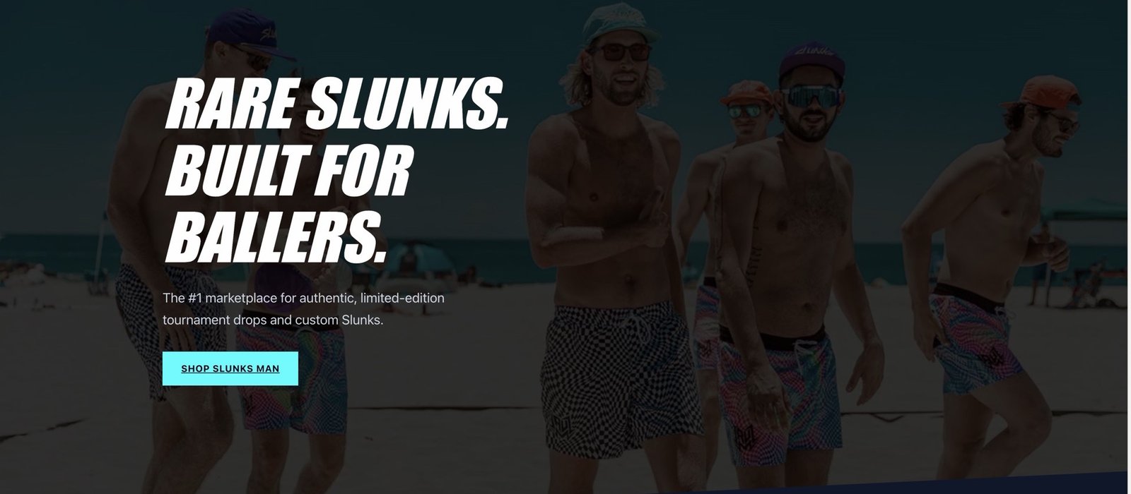
Slunks Man needed a brand identity that could cut through the noise of an oversaturated streetwear market. The goal was to create an editorial-grade visual system that felt raw and authentic while maintaining the precision of a luxury house.
We approached the project as a publication launch rather than a traditional rebrand. Every asset was treated like a magazine spread — bold typography, intentional negative space, and a colour palette that balances street grit with editorial polish. The identity had to work across digital, print, and physical product.


The Typography System
Type Hierarchy & Specimen
A heavyweight condensed grotesque was selected to channel the raw energy of street culture. Oversized type is used as a graphic element itself, filling frames and breaking boundaries. The secondary face brings legibility to long-form editorial content across lookbooks and digital.
01. Challenge
The streetwear space is crowded with generic logos and recycled aesthetics. Slunks Man had strong product but no visual story — they needed an identity that demanded attention on first glance.
02. Approach
We designed the brand like a magazine, not a clothing label. Every touchpoint — tags, packaging, social templates — was crafted with editorial rigor and cinematic composition.
03. Result
200%
Social growth in 90 days
50+
Brand assets delivered
Let's build something exceptional together. Get in touch to start your project.